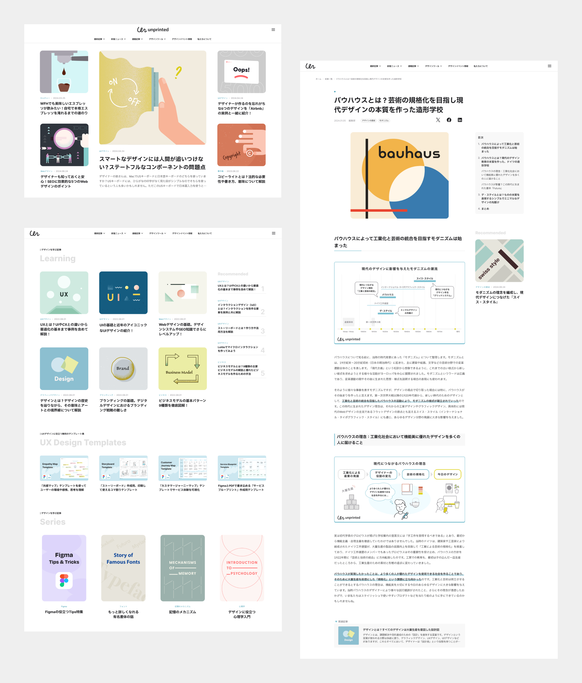
"unprinted" is an online magazine that offers content to make the daily lives of digital designers more enjoyable. I was involved in the project from the initial stage and was in charge of a series of designs, from developing the brand concept and the visual identity to designing the website.

What is needed in the site so that digital designers find it enjoyable? I thought it would be "a sense of fun" and proposed it as the design concept. I wanted to do more than just convey information, but provide an experience that allows visitors to appreciate the joy of design itself. By incorporating "a sense of fun" into the overall design while ensuring functionality and readability, I aim to enrich the brand experience and build a media platform that digital designers will want to visit regularly.
In this project, I defined "a sense of fun" as follows:
A "familiar" design coming with a twist
I believe that a sense of empathy arises from motifs and expressions that everyone is familiar with, and that adding a touch of whimsy or discovery to them sparks the imagination. I hope that such experiences will encourage people to enjoy design, leading to a sense of attachment to the brand.
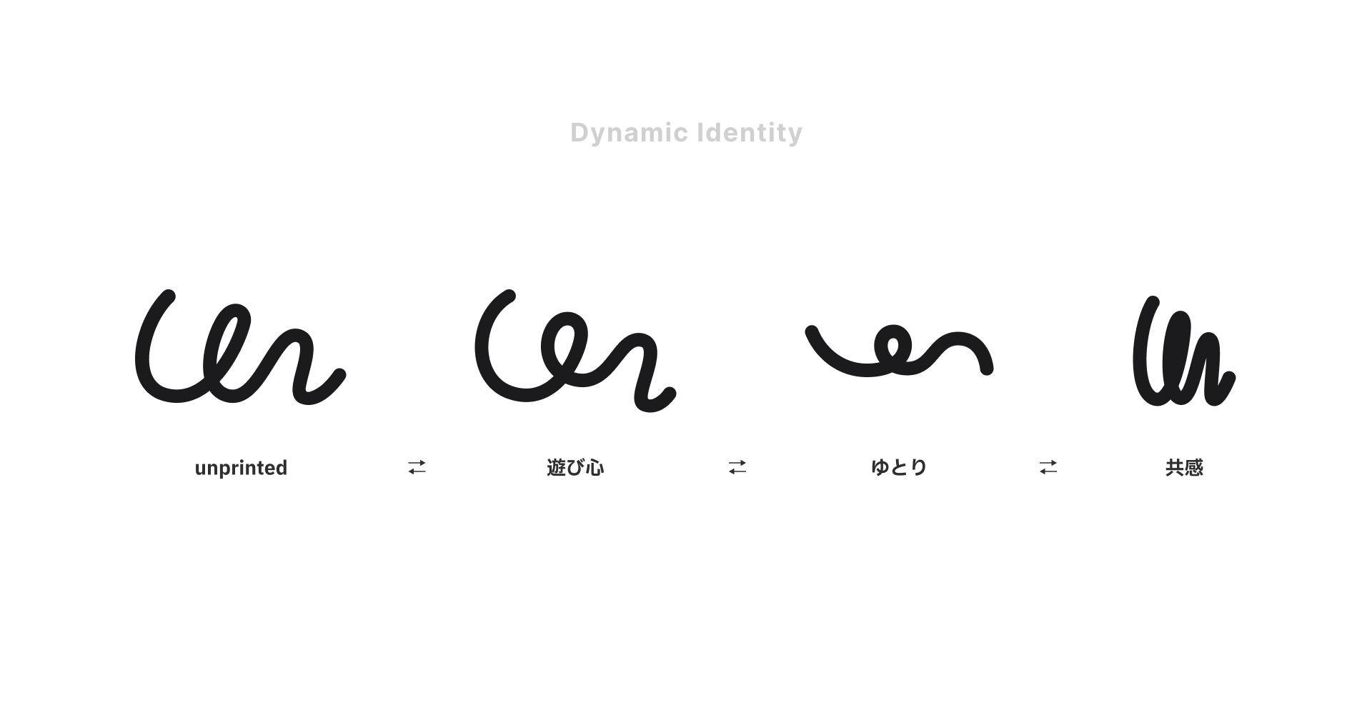
To make the symbol mark function as a graphic element, I adopted the method of dynamic identities, which allows it to change according to the conveyed message.
Taking inspiration from the "un" in "unprinted," which means "not printed," I designed a symbol mark that looks as if roughly drawn with the path tool or digital pen used in the design work. By using a familiar creative scene from the life of digital designers as the motif, I aimed to create a logo that evokes a sense of familiarity and empathy, allowing people to feel a connection to the brand.
For the logotype, I selected “Myriad,” a humanist sans-serif typeface that combines excellent legibility with a human touch. It strikes a balance with the rough, organic style of the symbol mark.
In addition, to express the "a sense of fun" outlined in the design concept, I adopted a dynamic identity in which the logo’s appearance changes to match the message or content we wish to convey. This allows the symbol mark to be used as a graphic element in various applications.
To make the symbol mark function as a graphic element, I adopted the method of dynamic identities, which allows it to change according to the conveyed message.


One of the key points in defining a color palette is that it should evoke a sense of familiarity and comfort. By designing a color system based on colors found in nature, I aim to create a brand that is pleasant to view in everyday life.
The brand color "Cyan" portrays a warm and bright blue that evokes the sky. Blue is a standard brand color for many services because of its image of intelligence, trust, and security. It is often used in vivid tones that lean toward purple for visibility, especially in the digital realm. The blue used by unprinted is "Cyan," which leans toward the yellowish blue found in nature, and the saturation has been adjusted to soften.
With "Cyan" as the key color, I defined the site's brand colors and created the color palette for graphic assets.
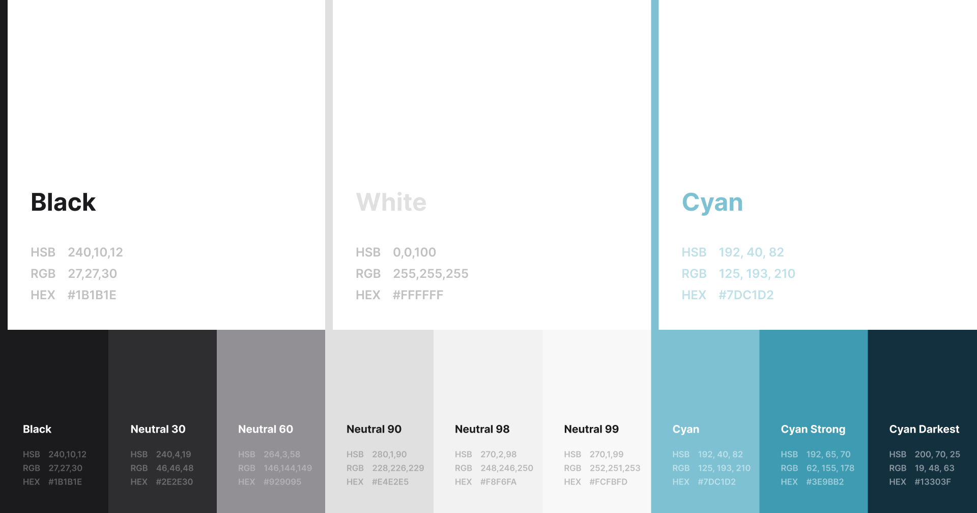
Brand colors

Color palette
I proposed applying two graphic rules to consistently convey "design with a sense of fun."
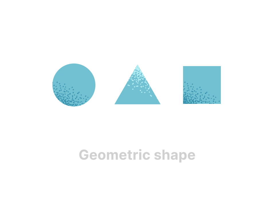
One is basic geometric shapes, such as circles, triangles, and squares. For many people, these geometric shapes are familiar motifs from childhood, found in building blocks. Since they can be combined to create an infinite variety of shapes, I adopted them as graphic elements that, while simple, convey the joy of creation.
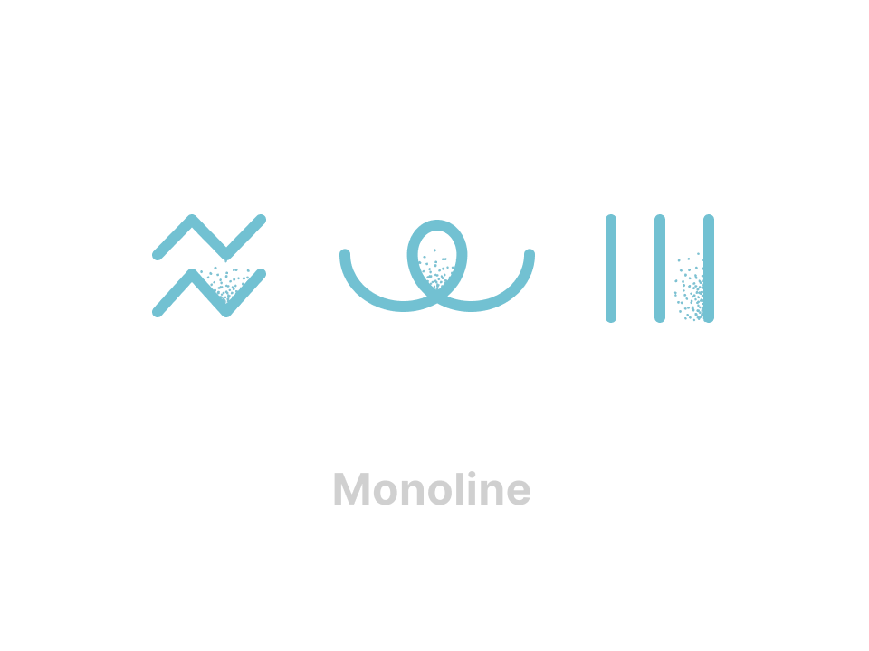
The other is to use lines of uniform thickness, such as those drawn with the Path tool. By incorporating visual language familiar to digital designers, I aimed to create a space that evokes empathy and a sense of connection with the brands, encouraging them to want to participate in the creative process.
See the graphic assets